Wouldn’t it be great if you had a batch of winning marketing campaign examples to ignite your creativity?
Well, luckily for you, we have just the ticket.
In this post, we’ll share some top marketing campaign management examples.
Each one gives you a fresh perspective on how to promote your brand, raise brand awareness and attract new customers — no matter your budget or the size of your marketing team.
Let’s see how it’s done.
1. Coca-Cola’s Share a Coke Campaign
Coke started its Share a Coke campaign by replacing its brand name on the bottle of Coke with 150 popular names and adding the “Share a Coke” tagline.
Because of its low price point, it was easy to encourage customers to buy a bottle for themselves and one for their friends or loved ones.
Share a Coke became a way to tell someone you were thinking of them.
The genius of this highly successful campaign was its simplicity. By using “Share a Coke” as its call to action, Coke inspired customers to buy more than they usually would.
Consider: Can you personalize your product so your target audience feels a special connection they want to share with others?
2. Dove’s Real Beauty Campaign
The Real Beauty Campaign started in response to a study that showed only two per cent of women described themselves as beautiful. Dove wanted to challenge the way society defines beauty.
One way they challenged the standard is the 2006 video called Evolution.
It’s a time-lapse video showing the steps that go into transforming a “normal” looking woman into the cover model you see on billboards and magazines.
The video was a hit. It had 1.7 million views in its first month on YouTube and became a viral sensation on social media.
Consider: How can your digital marketing campaigns can stand out and challenge the industry standard?
3. McDonald’s I’m Lovin’ It Campaign
This marketing campaign is a winning example of sonic branding, which is the use of a distinctive sound to make an association with a brand.
As part of their mission to update the brand, McDonald’s ran a competition among international ad agencies.
The winning idea was the “ba da ba ba ba, I’m lovin’ it” jingle, originally sung by Justin Timberlake.
It launched in Germany in 2003 for the first time and is still being used today, the longest-running ad campaign in McDonald’s history.
Consider: While you may not be running TV commercials, how can you use sound as part of your brand identity? Can you add it to your YouTube videos, your podcast intros and outros, or to the videos in your social media marketing strategy?
4. Nike’s Find Your Greatness Campaign
When Adidas won the spot as the official sportswear sponsor of the 2012 Summer Olympics, Nike needed a brilliant marketing campaign to counter the publicity Adidas would receive.
Nike created a series of commercials showing ordinary people doing things like running marathons, swimming, playing rugby, and other athletic pursuits.
The voiceover in the commercial says you don’t need to be part of the Olympics to be great: “Greatness is wherever somebody is trying to find it.”
The closing shot is on the powerful words “Find your greatness.”
The idea was to reach the everyday athlete with the inspirational message that greatness was for everyone.
Consider: How can you inspire potential customers to make them feel as celebrated as an Olympic athlete?
5. Old Spice’s The Man Your Man Could Smell Like Campaign
Old Spice faced a dilemma.
They wanted to target younger consumers in the 18 to 34 age range. But too many of those buyers associated Old Spice with their grandpas.
During their research, Old Spice discovered that women made 60% of body wash purchases, including those for men. So, they redefined their digital marketing campaign strategy and ran campaigns targeting women shoppers.
They recruited former wide receiver, Isaiah Mustafa, to star in the ad.
The ad has Isaiah tell the women viewers to “Look at your man. Now back to me. Now back at your man. Now back to me.”
It tells the story that while their partner may never look like Isaiah Mustafa, he can smell like Isaiah Mustafa, if they stop buying him lady-scented body washes.
And if he smells like Isaiah Mustafa, or Old Spice, well, anything was possible.
Consider: While your product or service may be for one gender or segment of the population, is there someone else who does the purchasing? How can you appeal to them?
6. Always’ Like a Girl Campaign
Research shows that a young girl’s confidence plummets when she reaches puberty. Always wanted to create an advertising campaign to counter that.
They created a short video that opens with individuals who range in age from older teens to young adults. The ad agency asked the men and women to do different things “like a girl” such as fight, throw, and run.
As you might expect, there’s lots of giggling, limp arms, and caricature-like moments of being “like a girl.”
But when prepubescent girls were asked to perform the same actions, they were strong and confident.
The ad was a big hit.
76 percent of women 16 to 24-years-old said that the video changed their perception of the phrase “like a girl.” It no longer seemed like an insult. And two out of three men said the video made them think twice about using “like a girl” as a taunt.
The campaign was so successful, even without showing or discussing the product, because it was an “emotional brand message.”
Consider: How can you tap into the emotions of your target market and enhance your campaign performance?
7. ALS Ice Bucket Challenge
The Ice Bucket Challenge is an example of a digital marketing campaign that has gone viral.
The challenge was to pour a bucket of ice water over your head, share a video of it on social media, and ask your friends to do the same. If you didn’t complete the challenge in 24 hours, you donated $100 to ALS research.
Not only did this produce some wildly popular content in 2014, but it showed how “challenges” can drive massive engagement with the right social media marketing campaign — just look at the countless branded challenges on TikTok.
It got its organic start with Pete Frates & Pat Quinn, who used their extensive social networks to draw attention to the challenge.
Soon the challenge reached celebrity circles with participants like Ethel Kennedy, Bill Gates, and the New England Patriots.
Consider: How can user generated content on your social media channels and influencer marketing expand your reach and brand recognition?
Related Reading: What is Social Media Marketing? A Simple 8-Step Strategy [2024]
8. Red Bull’s Stratos Campaign
While Red Bull says Stratos was not an advertising stunt, it was a huge hit with their target market of young men into extreme sports.
In 2012, Felix Baumgartner did a live parachute jump from the stratosphere, becoming the first person to break the sound barrier in freefall.
Red Bull funded the 330 million dollar project, and Red Bull branding is visible in every second of the three-hour video.
The record-breaking event was live-streamed in 50 countries and was watched by over 8 million live viewers on YouTube.
Consider: Can you attach your branding to a record-breaking challenge on a smaller scale?
9. The California Milk Processor Board’s Got Milk Campaign
In the early 1990s, milk sales were down.
Consumers were no longer buying milk simply because milk “does a body good.” And there was increasing competition from soft drinks and sports drinks.
During their research, the ad company discovered that while no one was excited to buy a quart of milk, it was still a household staple and consumers got frustrated when they ran out.
The “Got Milk?” campaign was born.
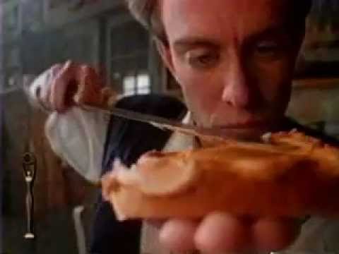
The most memorable of the original commercials was the “Who Shot Aaron Burr?” commercial.
A man is eating a peanut butter and jelly sandwich when he has the opportunity to answer a question in a trivia contest. The man knows the answer, but the trivia judge can’t understand what he is saying.
If only he hadn’t run out of milk, he could wash down the peanut butter and give an intelligible answer.
Consider: How can you show your product solving a potential customer frustration?
10. Nike’s Just Do It
Nike’s Just Do It campaign is another brilliant marketing campaign that uses emotion to reach the target audience.
When Nike featured 80-year-old Walt Stack running 17 miles every morning, it inspired the viewer to face their own challenges. Nike reinforced the message in the closing shot of the commercial. It says, “Just Do It.”
The focus is never on the shoes or how the shoes help the person be a better athlete. The focus is evoking an emotional response to the brand.
Consider: How can you help your customers feel like they can tackle a challenge they face and reach your campaign goal?
11. Apple Think Different Campaign
In 1997, Apple launched the iconic Think Different campaign.
Though grammatically incorrect, the wording was a purposeful choice by Steve Jobs to drive home the point that Apple is so different when compared to other computers, and Apple users are proud to be part of that difference.
The ad ran with images of icons like Einstein, Gandhi, and Picasso, cultural giants who were labeled crazy in their lifetimes, but whose work changed the world.
With that brand awareness campaign, and Steve Jobs back at the helm, Apple’s financial standing and brand loyalty and perception skyrocketed.
Consider: How can you use individuality to stand out and meet your marketing goals?
12. Blendtec’s Will It Blend?
While the name of the company might escape you, it’s likely you’ve seen at least one of their goofy, late-night-tv-like ads.
Will It Blend is the unusual marketing activity used by Blendtec to show how powerful its blenders are.
Blendtec founder Tom Dickinson tosses various items into the blender to see what happens. Marbles, golf balls, iPhones, and an Amazon echo are just a few of the test subjects. And with over 140 oddly suspenseful and super-entertaining to watch, Will It Blend is digital marketing done right.
The YouTube channel has over 864,000 subscribers, and some videos have over 7.9 million views. With that kind of reach, it wouldn’t be unusual if the Blendtec brand was first on your list when you shop for a new blender.
Consider: What wacky marketing tactics, help you stand out from your competition?
Related Reading: 7 Content Marketing Examples That’ll Inspire You (2024)
13. The Pepsi Challenge
Back in the 70s, Coca-Cola was the giant of the soft drink industry. Pepsi wanted to overtake Coke. So, they created the Pepsi challenge.
A legendary interactive marketing campaign, The Pepsi Challenge was a blind taste test between Pepsi and Coke. The challenges took place in shopping centers, malls, parks, and other public locations.
The Pepsi representative presented the taste tester with two white cups, one of Coke, the other of Pepsi.
After the drinker had tasted both and showed their preference, the representative would lift the partition that divided the table, revealing that the winning drink was Pepsi.
Consider: Can you go head-to-head with a competitor and come out on top?
14. FedEx’s When It Absolutely, Positively Has To Be There Overnight
FedEx was the new kid on the block in the package delivery business.
The chief competitor, Emery, focused their advertising on price, so FedEx created another way to stand out.
Rather than focusing on price, FedEx created campaigns around the result they got for their customers.
Humor is the standout component of their most well-known ad with fast-talking actor John Moschitta, Jr. He portrays a very busy executive in a high-stakes business world who needs things done fast. And you don’t get faster than overnight delivery.
Ad Age ranked the ad as number 11 in the Top 100 Advertising Campaigns of the Twentieth Century. And it worked because FedEx focused on the customer and solving the customer’s problem.
Consider: What result do you get for your customers? Show them.
15. Dos Equis’ The Most Interesting Man In The World
Instead of trying to capture the younger party crowd as most beer companies do, Dos Equis marketers distinguished their brand by creating a character that people might aspire to — a Hemingway-esque gentleman — The Most Interesting Man In The World.
The commercials are witty.
The actor, John Goldsmith, is on varying adventures, with the voiceover saying things like “If opportunity knocks, and he’s not home, opportunity waits.” Or “Locals ask him for directions.”
He’s a charismatic, worldly figure that everyone wants to be around and everyone aspires to be.
His punchline is “I don’t always drink beer, but when I do, I prefer Dos Equis.” The line has become the basis for popular internet memes and hilarious parody content.
Consider: How can your brand messaging be aspirational?
16. American Express’ Small Business Saturday
Small Business Saturday is the antithesis of Black Friday, with a focus on the small brick-and-mortar stores that make up communities.
American Express created the Shop Small campaign during the 2010 recession to encourage people to shop with small businesses during the holiday season. In 2011, the US Senate gave the Shop Small campaign official status.
The Shop Small campaign has been so successful because of the nostalgia people feel for small businesses and the impact small businesses have on the community they serve.
Consider: If you serve your local community, how can you highlight that in your marketing message?
17. Nike’s Play Inside
At the start of the pandemic, Nike wanted to encourage people to maintain social distancing while remaining active.
Play Inside was their answer.
One part of their campaign featured Nike athletes like Michael Jordan and Serena Williams posting to their social media feeds a post that read, “If you ever dreamed of playing for millions around the world, now is your chance. Play inside. Play for the world.”
Nike also ran a video ad with the same message, featuring people who were playing basketball alone, lifting weights alone, and working out alone.
Consider: How can your brand bring people together for a common cause? Or against a common threat?
18. Corona’s Pay With Plastic
To support World Oceans Day on June 8, Corona created a purpose-driven marketing campaign to connect with consumers who are environmentally conscious and want to support brands that feel the same.
This effective marketing campaign had two options for consumers. The first was to trade plastic waste for beer at retailers and bars in Mexico, Brazil, Italy, Spain, and Columbia.
The second option was for consumers to buy a limited edition six-pack made up of upcycled materials. For every six-pack sold, Corona and their partner, Parley for the Oceans, would clean up one square meter at a local beach.
Consider: How can you connect with socially driven consumers?
19. WestJet’s Christmas Miracle
WestJet Airlines had a Christmas surprise for travelers that generated a lot of goodwill.
Travelers on WestJet Airlines, departing from Toronto and Hamilton International Airports told a virtual Santa what their dream Christmas present would be.
As those travelers flew from their departure sites to their destination at Calgary International Airport, one-hundred and fifty team members worked behind the scenes to shop for and wrap those dream presents.
When the travelers landed, they found gift-wrapped boxes waiting for them.
Richard Burton, Vice president of Communications and Community Relations, said, “…We wanted to turn our holiday marketing campaign into a tradition by doing something that’s never been done before…We wanted to surprise guests with meaningful, personalized gifts when they least expected them.”
Consider: In what unexpected way can you surprise your audience?
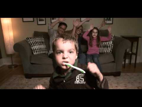
20. Oregon Dental Association’s Teach Me How To Brushy
The Oregon Dental Association wanted a fun way to get children excited about brushing and flossing their teeth.
So they created a music video set to “Teach Me How To Dougie” by Cali Swag District. The video featured well-known local figures such as former Portland Trailblazer Jerome Kersey.
The video took off on social media, and Good Morning America, the Huffington Post, and other publications picked up the story.
Consider: Are there local celebrities you can bring into your campaign? How can you reach your target audience in an unexpected and fun way?
21. UNICEF’s Facebook Likes
UNICEF Sweden wanted to remind their Facebook supporters that Facebook “likes” don’t equal monetary support, which is needed for UNICEF to continue their work
They created three videos to make their point. The most intense of the three, called “Facebook Likes Don’t Save Lives,” shows a young boy standing in a dark shack, his younger brother sitting on a mat on the floor.
The young boy worries about who will take care of his brother if he gets sick. But then he says that everything will be fine because “Today UNICEF Sweden has 177,000 like on Facebook. Maybe they will reach 200,000 by summer. Then we should be alright.”
The more humorous of the videos shows a man attempting to pay for his meal at a restaurant with Facebook likes.
Consider: Can you use both serious and humorous components in your campaign?
Final Thoughts On These Marketing Campaign Examples
Sure, creating a successful marketing campaign can be a challenge. But get it right, and your marketing efforts will pay off.
With these top-notch examples, and a willingness to be creative, you have the inspiration needed to create a winning campaign and smash your business goals.
Pick just one, brainstorm ways to make it work for your business, and get started on your campaign today.


Thank you for providing such an insightful post. It’s a really helpful and well-written blog.