Looking for high-performing landing page examples to inform and inspire your next design?
Well, we’ve got 24 examples of sizzling landing pages that convert like crazy.
But simply copying good landing page examples isn’t enough.
To create your own high-performing landing page, you’ll need to understand:
- How landing pages work.
- The key criteria of top-performing landing pages.
- What makes each of our examples so great.
- How they can be improved.
We’ve got you covered on all fronts. And after reading this article, you’ll be able to super-charge your site’s landing pages and reel-in more red-hot conversions.
Let’s hop to it.
What is a Landing Page?
A landing page is a web page with one specific purpose — to deliver information that convinces visitors to take an action you want them to take.
To do so, every landing page must accomplish two objectives:
- Keep visitors engaged (scrolling and reading)
- Identify and communicate key information that convinces visitors to take the desired action.
Every element of your landing page (headline, copy, images, etc.) should be tailored to a specific target audience and should work together to convince them to take the desired action.
Sure, no landing page can convert every single visitor, but you shouldn’t approach them with a “willy-nilly” attitude, or expect your blog posts and social media ads to all your content marketing heavy-lifting.
In other words: use landing pages as methodically as possible if you want to maximize your conversions. Thankfully, the examples in this post will give you plenty of inspiration and tactics to test out.
Key Features of a Sizzling Landing Page?
Landing pages have many features. They can be divided into two categories, with many landing pages fitting both.
Engagement-Oriented Features:
Features tailored toward getting visitors to keep reading/scrolling, including:
- Lots of white space, subheadlines, and images that make your page more manageable and easier to skim.
- Short paragraphs.
- Words your audience understands.
- Headlines and copy that capture visitors’ curiosity.
Conversion-Oriented Features:
Features tailored toward convincing visitors to convert, including:
- Headlines, images, and copy that tap into your audience’s pain-points, connect the features of your product (or desired action) to the benefits they provide, and paint a picture of how great life will be once they’ve taken your desired action.
- A well-designed, prominently-placed CTA that uses action-oriented words.
- Other conversion-boosting tactics like social proof, objection handling, and video content.
Signup Landing Page Examples
1. Nakisa
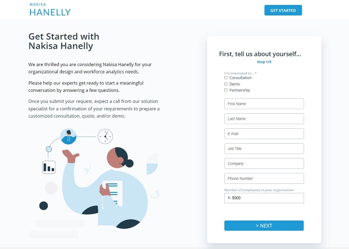
Nakisa Hanelly is a company that offers solutions to help companies organize and improve their operations. This landing page aims to get visitors to sign up for a demo of their software.
What Sizzles?
- Lists the top features that make the product special.
- Tells prospects exactly what to expect after signing up.
- Signup form collects key demographic and psychographic info for their sales team.
What Sputters?
- Visitors have to scroll down to see the product benefits/features. These should be more accessible.
- Should include actual images of the product to help prospects visualize using it.
2. Intouch Insight
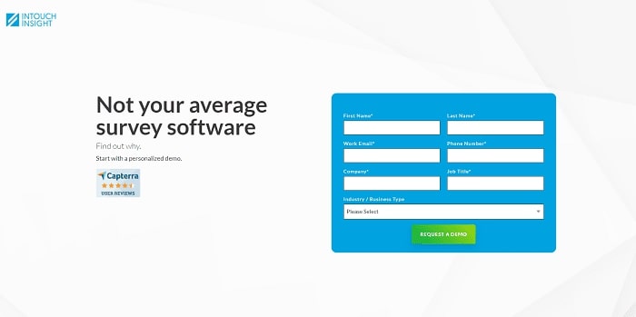
Intouch Insight sells software and services that help clients use data to create better customer experiences. This landing page aims to get visitors to sign up for a product demo.
What Sizzles?
- Short signup form that only collects pertinent info.
- Includes 4 customer reviews to provide social proof.
- Lists features and capabilities of product.
- Includes product image to help prospects visualize using it.
What Sputters?
- Should connect product features to the benefits they provide.
- Should A/B test listing product benefits above the fold next to the signup form.
3. Netflix
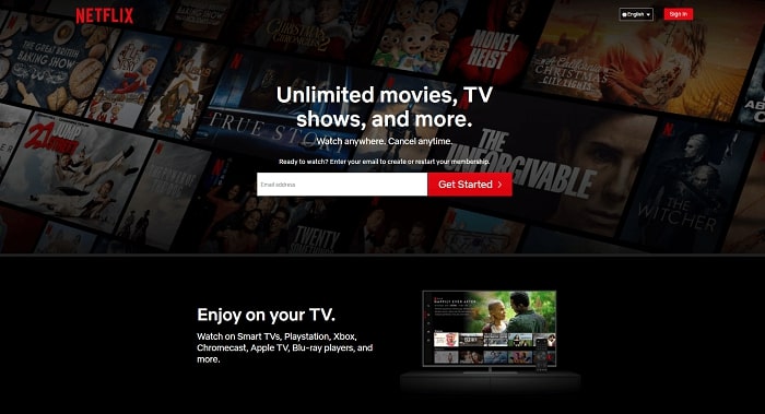
Netflix is a streaming service for movies and tv shows. This landing page aims to get visitors to sign up for a membership.
What Sizzles?
- Lists attractive product features (how to watch, profiles for kids, etc.)
- Addresses FAQs.
- Handles common objections (“Cancel Anytime”, etc.)
- Landing page is short and to the point.
- Signup form is super short, making the process a breeze.
What Sputters?
- Could include customer reviews for social proof.
- OPINION: I like companies that are transparent with costs. They should A/B test including product tiers/costs on their landing page.
4. Lyft
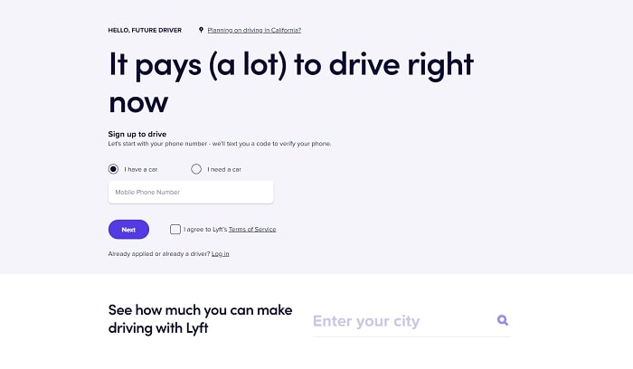
Lyft is a rideshare service. This landing page aims to recruit new Lyft drivers.
What Sizzles?
- Signup form only asks for a phone number. The rest of the process is handled through text.
- Outlines the process and benefits of driving for Lyft.
- Addresses common questions with a FAQ.
- Informs prospects of features/benefits they might not even think to ask (calculate how much you’ll make in your city, car rentals, etc.)
What Sputters?
- Could include driver reviews as social proof.
- Could separate each section better (via bigger subheads or design) to increase visitor engagement.
5. Daily Stoic
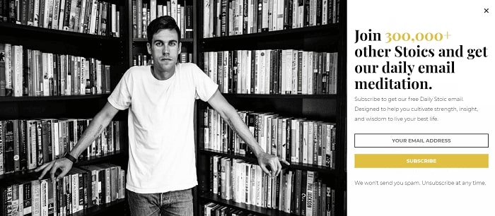
Daily Stoic is a website that teaches Stoic philosophy and how to use it for modern challenges. This landing page aims to get visitors to join their mailing list.
What Sizzles?
- Succinctly describes the benefits of the mailing list (“cultivate strength, insight, and wisdom)
- Lists the number of subscribers to provide social proof.
- Signup form has just one field, making the process a breeze.
- Handles common objections (no spam, unsubscribe anytime).
What Sputters?
- Could include reviews from other subscribers.
- Could use a picture that better conveys the benefits of subscribing. Perhaps one of their emails.
SaaS Landing Page Examples
6. Reflectly
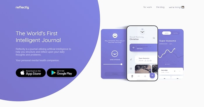
Reflectly is a journaling app that uses AI to help users develop a daily journaling habit and improve their mental health. This landing page aims to get visitors to download their app.
What Sizzles?
- Landing page is simple and easy to read.
- Includes images of the app to help prospects visualize using it.
- Succinctly explains primary benefit of using Reflectly (help improve reflection on your thoughts and problems)
What Sputters?
- Should include user reviews for social proof.
- Should list more practical benefits, as they do on their other marketing content. (i.e. become happier, reduce stress, etc.)
- Should connect product features to benefits.
7. Anylist

Anylist is an app for collecting and sharing shopping lists and recipes. This landing page aims to get visitors to download their app.
What Sizzles?
- Includes images of the app to help prospects visualize using it.
- Connects product features to the benefits they provide.
- Excellent page design that breaks up each section and keeps visitors engaged.
What Sputters?
- Should include more user reviews for social proof.
- Could try including a video demonstrating the product in use.
8. Dropbox
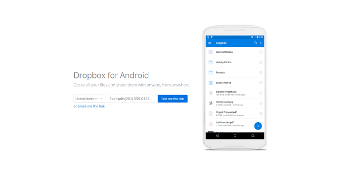
Dropbox is an app for storing and sharing files across devices and with others. This landing page aims to get visitors to download Dropbox.
What Sizzles?
- Super simple, straightforward design.
- Includes an image of the app to help prospects visualize using it.
- Succinctly explains the purpose and value of Dropbox.
- Short signup form to reduce friction and increase downloads.
What Sputters?
- Should include user reviews for social proof.
- Doesn’t describe any product features.
- Should include potential applications of the product.
9. Paypal
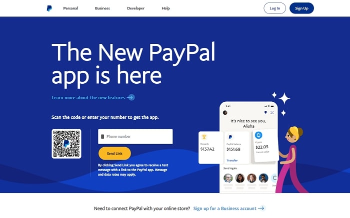
Paypal is an app for sending and receiving money. This landing page aims to get visitors to download and sign up.
What Sizzles?
- Incentivizes downloads with a $5 signup bonus.
- Visitors can download the app by entering their phone number or scanning the QR code.
- Lists the major features of the product and connects them to the benefits they provide.
- Includes a rolling count of Paypal users as social proof.
What Sputters?
- Should include reviews/testimonials for more social proof.
- Should include images or video of the product being used to help prospects visualize using it.
10. Calm
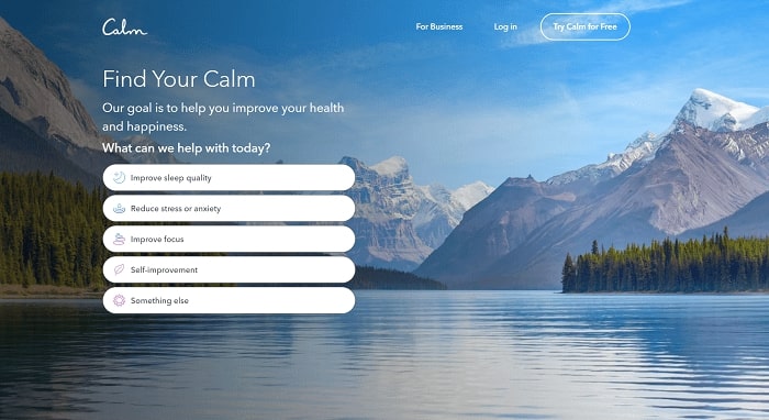
Calm is a mediation app that helps users reduce stress and boost happiness. Their unique landing page actually comes in several parts.
What Sizzles?
- The first few pages ask questions about what the visitor hopes to get from using Calm. Alternatively, visitors can navigate directly to the signup form.
- After each answer, the landing page displays benefits and social proof.
- The actual signup form is short and easier. Alternatively, prospects can sign up with Facebook or Google.
What Sputters?
- Should include images or video demonstrating the app in use.
- There’s no mention of the features of Calm (i.e what makes their meditations work so well).
Lead Magnet Landing Pages
11. Zoom
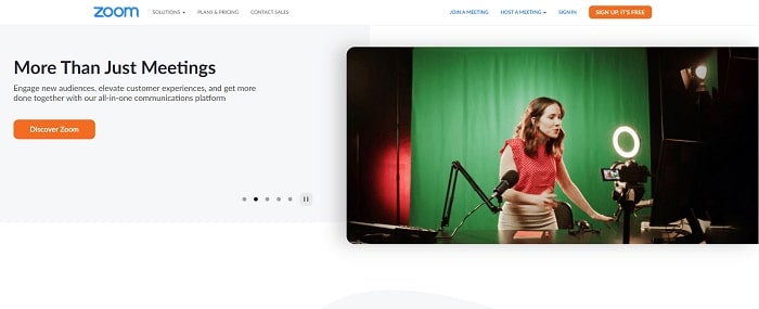
Zoom is a video conferencing app that targets businesses and professionals. This landing page aims to get visitors to download their industry report lead magnet.
What Sizzles?
- Lists some of their big-name customers as social proof.
- Uses the signup form to collect important data that can help them convert leads.
- Shares the features and benefits of their product.
What Sputters?
- Uses lots of industry jargon that prospects may not understand.
- Doesn’t provide a great description of what the report is about.
12. SEMRush

SEMRush is a marketing tool for SEO, content marketing, and paid advertising. This landing page is for their webinar on hiring the right growth team.
What Sizzles?
- Clearly outlines everything the lead magnet will teach.
- Lists the expert teachers who’ll be featured in the webinar.
- Includes a “Register” CTA above the fold that instantly brings visitors to the signup form at the bottom of the page.
What Sputters?
- Landing page is text-heavy. Could include more images.
- Should describe what the teachers do and why they’re experts.
13. Frost & Sullivan
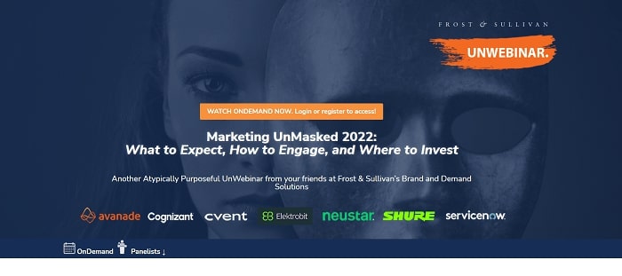
Frost & Sullivan is a consulting company that helps businesses plan and execute growth strategies. This landing page is for their webinar on the future of marketing.
What Sizzles?
- Lists the names and credentials of their expert panelists.
- Lists several of their big-name clients as social proof.
- Lists all of the subjects in their webinar, and lets prospects select the ones they’re interested in.
- Uses a detailed signup form that collects pertinent sales info.
What Sputters?
- Landing page looks cluttered. Could be better designed.
- While collecting lots of sales info can help their sales team, it can also reduce registrations.
14. Instapage
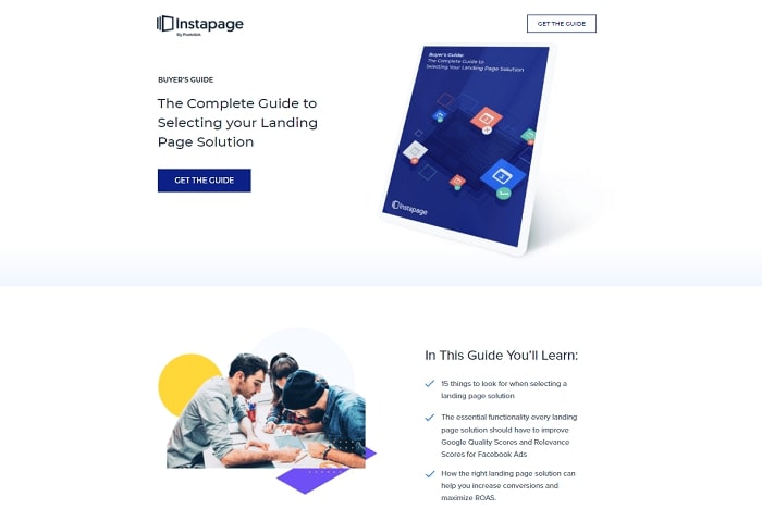
Instapage is a platform for building landing pages. This landing page is for their ebook on selecting a landing page solution.
What Sizzles?
- Clean, simple design.
- Lists everything the guide will teach, and connects those lessons to the benefits readers will get.
- The signup form pops up when visitors click the CTA, allowing them to devote more real estate to describe the lead magnet.
What Sputters?
- Could include their big-name clients as social proof.
15. HubSpot
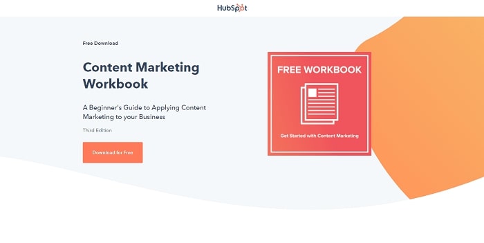
HubSpot is a customer relationship management platform for creating synergy between marketing and sales teams. This landing page is for their “Content Marketing Workbook.”
What Sizzles?
- Describes everything the ebook will teach, and connects those lessons to the benefits they’ll provide.
- Well-designed. Great utilization of white space and color.
- Addresses FAQs aimed at increasing downloads.
- The signup form pops up when visitors click the CTA, allowing them to devote more real estate to describe the lead magnet.
What Sputters?
- Text-heavy section at the bottom.
- The signup form asks for a lot of info, which may decrease downloads.
eCommerce Landing Pages
16. Four Sigmatic
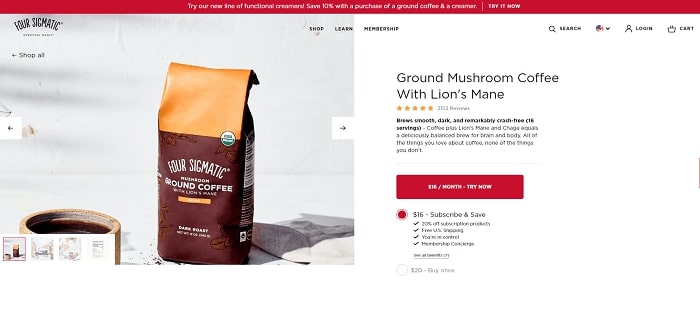
Four Sigmatic is an eCommerce company that sells mushroom-based protein shakes, coffee, and mixes. This landing page is for their Lion’s Mane Mushroom Coffee.
What Sizzles?
- Answers every possible question prospects could have, including product ingredients, what to expect, and FAQs.
- Includes images and video of the product.
- Includes testimonials from regular users, famous influencers, and top health and wellness brands.
What Sputters?
- Longer landing pages can sometimes overwhelm or distract prospects.
- Landing page looks a bit cluttered.
17. Athletic Greens
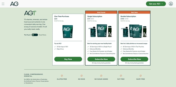
Athletic Greens is an eCommerce company that sells a shake that provides all of your daily vitamins, minerals, and more. This landing page (which is also their homepage) is for their product.
What Sizzles?
- Includes testimonials from famous influencers as social proof.
- Describes the benefits of the product.
- Provides a detailed breakdown of how the product provides those benefits.
- Allows visitors to see their full ingredient list (more of the transparency that I like).
What Sputters?
- Should also include testimonials from regular customers.
- Landing page is a bit cluttered and text-heavy.
18. Jawzrsize
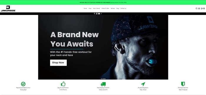
Jawzrsize is an eCommerce company that sells exercise equipment for your jaw. This landing page promotes their beginner jaw exerciser.
What Sizzles?
- Utilizes images, video, and graphics to demonstrate how the product works.
- Includes lots of customer reviews for social proof.
- Clearly outlines how to use the product.
- Handles objections by sharing product warranty info, product quality info, and more.
What Sputters?
- Should utilize the left side of the page below the product image to make the page less cluttered and easier to read.
- Objection handlers are small and can be easily overlooked.
19. Kodiak Cakes
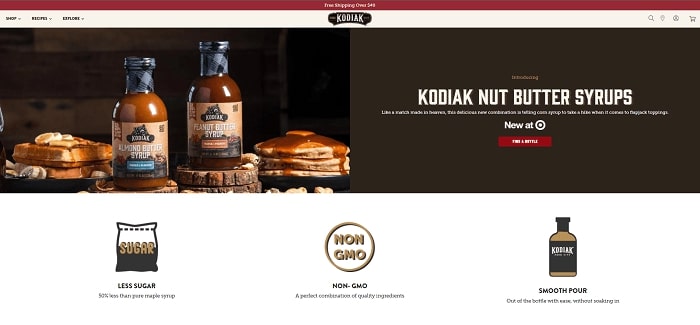
Kodiak Cakes is an eCommerce company that sells top-quality maple syrup. This landing page is for their syrups.
What Sizzles?
- Fantastic images! If they don’t make your mouth water, nothing will.
- Includes social proof from top brands that endorsed them.
- Describes the ingredients, features, nutrition facts, and applications of the product.
- Attractive page design that splits up the heavier text with images.
What Sputters?
- Should include customer reviews.
- The CTA might lead some to believe the product can only be bought in stores. When in fact, it redirects to another landing page for online ordering.
20. Versare

Versare is an eCommerce company that sells room dividers, cubicles, and acoustical partitions for offices. This landing page is for their room dividers.
What Sizzles?
- Rather than cluttering the page with tons of info, the page provides buttons visitors can click to see the product info they’re interested in.
- Includes product description, features, delivery info, and customer reviews.
- Handles objections throughout the page.
What Sputters?
- Should connect product features to the benefits they provide.
- Objection handlers are small and can be easily missed.
- Should use better-quality product images.
Long-Form Landing Pages (AKA Sales Pages)
21. Inbox Army
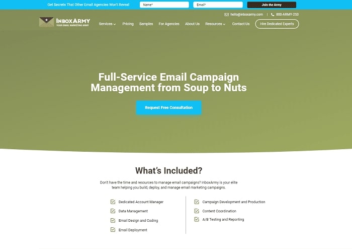
Inbox Army is an email marketing agency. This landing page is for their Campaign Management Service.
What Sizzles?
- Provides a full breakdown of how the service works and the benefits prospects will receive.
- Describes why prospects should choose them over their competitors.
- Includes multiple in-depth customer reviews, as well as top brands they’ve worked for as social proof.
- Includes links to case studies that demonstrate their ability to get results.
- Uses a simple but effective signup form.
What Sputters?
- Should A/B test using two signup forms — one at the top and bottom.
- Some info seems repetitive.
22. Purple
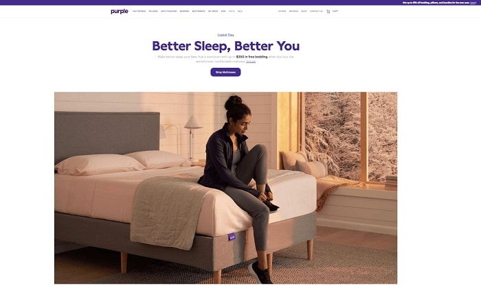
Purple is an eCommerce company that sells mattresses and bedding. This landing page is for their Purple Plus Mattress.
What Sizzles?
- Handles objections immediately where visitors will see them (below product image), as well as throughout the landing page.
- Describes how the product works in great detail, using images, video, and graphics.
- Includes many customer reviews as social proof.
- Provides many ways for prospects to contact customer service for more info.
What Sputters?
- Lots of info that can overwhelm some prospects.
- Lots of blank space under the first product image.
- Text-heavy landing page.
23. Somnifix
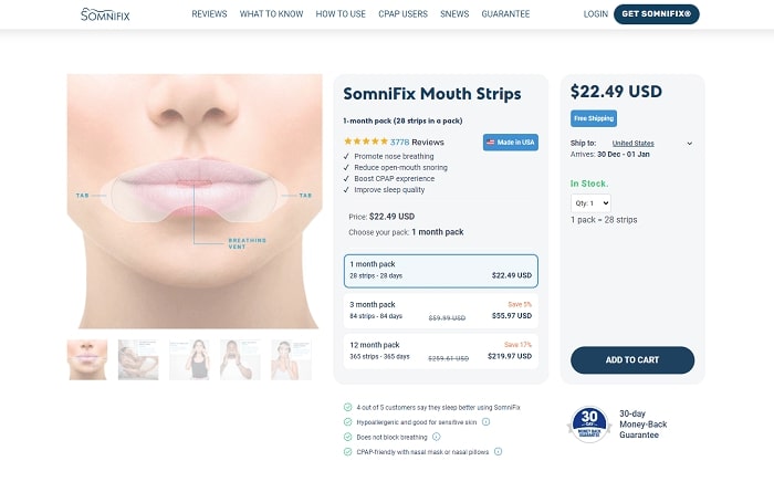
Somnifix is an eCommerce company that sells mouth strips designed to reduce snoring and improve sleep quality. This landing page is for their mouth strips.
What Sizzles?
- Devotes significant real estate to handling objections by sharing shipping and return policy info.
- Includes endorsements from medical professionals and customer reviews as social proof.
- Provides step-by-step instructions on how to use the product.
- Demonstrates how the product works using images and graphics.
- Includes a floating table of contents so you can skip to whatever part of the page you want.
What Sputters?
- Landing page is very long. Prospects may not scroll down far enough to see important info like the customer reviews.
24. OptinMonster University
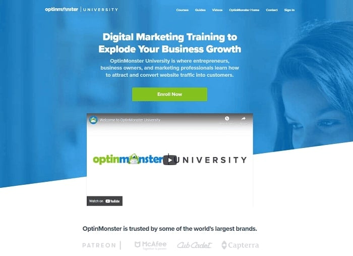
OptinMonster University is a lead generation tool for creating marketing funnels, email campaigns, and landing pages. This landing page is for OptinMonster University, their course that teaches marketers and business owners how to generate leads.
What Sizzles?
- Provides a detailed description of why the course is so valuable, what’s in it, and what prospects will learn.
- Includes lots of student reviews sprinkled throughout the page.
- Lists big-name brands that use their software as social proof.
- Includes a FAQ.
- Includes a video that prospects can watch instead of reading the full landing page.
What Sputters?
- Landing page is long and text-heavy.
- Should break up text with more images.
Start Designing Your Landing Page Now!
By now, you’ve seen all the high-converting landing page examples you’ll ever need.
What’s more, you have a better understanding of how landing pages work and what features make each of our landing page examples so special.
Don’t stop now. Turn your newfound knowledge into action by:
- Picking the landing page examples that most closely match your product or service.
- Using their best features as inspiration for your own landing page.
Then create your own sizzling landing page and watch the conversions roll in!


Netflix really rocks for pulling your attention to pretty much do one thing. No fluff. No bloated design. This is a great exercise in clarity. Super post Germano.
The landing page is the most important page of a website it should be the most attractive page than any other page on the website. Thanks, Germano for giving these examples to those people who need this cause when I started doing blogging I faced many troubles. It makes me happy to see a person like you who helps others. Keep it up!