More importantly, it influences your reader’s overall experience.
A well-designed blog is easier to read, more engaging, and even has better SEO results.
So, while you might be tempted to overlook design if you’re just starting your blog, you may want to rethink that choice.
Luckily, a good blog design doesn’t have to be fancy or complicated!
In this post, I’ll examine 21 sites with creative blog design (including some standout elements you might want to swipe). Then I’ll wrap with a brief explanation of best design practices, so you can focus on writing great blog content.
Whether you’re just starting your blog or ready to make millions, let’s look at what makes for a dazzling blog design.

21 Examples of Beautiful Blog Design
As anyone who has spent time perusing the internet recently knows, there are lots of blogs out there. Over 600 million, according to some estimates!
The following blogs are not only good-looking but also include specific design elements you can borrow for your own blog design inspiration.
So from A to Z (technically, U), let’s look at these examples of blogs and what makes them stand out from the crowd.
1. 500px

Category: Photography Blog
Steal This Idea: Makes use of incredible photography as part of their visual-heavy design.
500px is designed and built for photographers. With member portfolios, photo licensing, and a resource hub, 500px will provide never-ending visual inspiration.
Take a look through their blog to get ideas for what kind of images you could use for your blog’s featured image spot.
2. Airbnb
Category: Travel & Hospitality
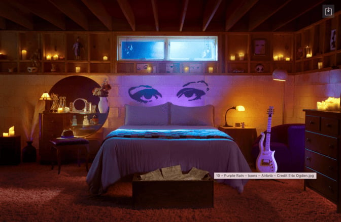
Steal This Idea: Stunning, real images from actual Air BnB rentals.
The Airbnb blog uses eye-catching images to accomplish its main goal: make you want to stay in an Air BnB.
And I have to say, it works! The photo above is an Air BnB house inspired by The Artist (Formerly Known as Prince).
They also use quotes and real-life examples from their Hosts, which makes the service feel even more relatable and accessible.
3. Austin Kleon
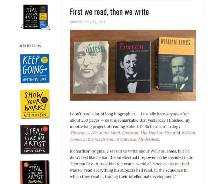
Category: Author Website
Steal This Idea: Austin displays all his books in a sidebar. It’s obvious without being in the way.
Austin Kleon is a self-described “writer who draws.” Since he “makes art with words and books with pictures,” his website and blog make heavy use of visual images.
One of my favorite user interface (UI) Design elements is how he incorporates a sidebar on the left side of his site to keep his books top-of-mind.
Heads up: this site is an exception to the one-or-none sidebar recommendation in the tips at the end of the post.
4. BarkPost
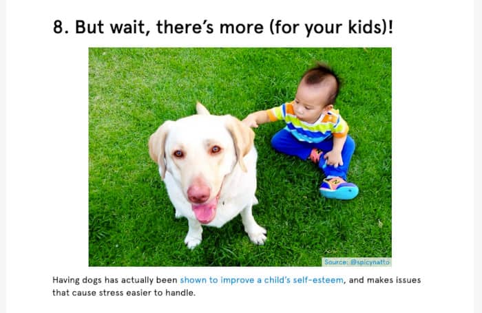
Category: Content Division for a Retail Company
Steal This Idea: Dog. Photos. Everywhere.
The internet loves animals. And with pet industry spending expected to grow, BarkBox uses a brilliant content marketing strategy to get its share.
BarkPost, the dog-themed content site associated with the BarkBox monthly subscription service, “helps dogs share their stories with the world, using the power of the hoomans.”
Because what dog owner can resist the power of puppy dog eyes (and stories)? Certainly not this writer.
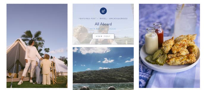
5. Brit + Co
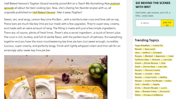
Category: Lifestyle Blog
Steal This Idea: Wows with gorgeous imagery.
You would be forgiven for mistaking the Brit + Co blog for a design magazine. Every blog post is full of topical magazine-quality visuals.
Whether it’s recipes for key lime pie bars and cocktails or a step-by-step guide to the ultimate edible garden, the photography helps the reader feel like they can succeed.
6. charity: water
Category: Nonprofit & Charity
Steal This Idea: Makes excellent use of multimedia to highlight their philanthropic work.
Nonprofits like charity: water have branding challenges that are slightly different from the other for-profit businesses highlighted in this article.
They have to woo fundraisers and partners as well as demonstrating the value of their work. And charity work isn’t often “sexy.”
The team who runs the charity: water blog does a great job of making their work both fun and impactful.
7. Copyblogger
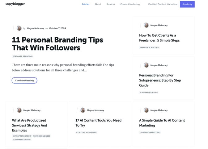
Category: Marketing Blog
Steal This Idea: Simple, minimalistic design
Often, less is more. Copyblogger finds an ideal balance with a simple color palette, bold typography choices, and minimal imagery. Their WordPress blog site lets the content shine.
And there’s no mistaking the next step you should take after reading one of their blog posts. Copyblogger keeps each call to action (CTA) clear and to the point.
8. Create + Cultivate
Category: Business & Lifestyle Blog
Steal This Idea: Uses visual links at the top of longer posts to make navigation easier.
Not just another lifestyle blog, Create + Cultivate sits at the intersection of small business, life, and wellness. Their ideal reader is a self-described “ambitious woman” who either runs a small business or has a side hustle.
The Squarespace site makes design inspiration easy with a consistent color palette woven through the entire website, including their color-block navigation menus at the top of longer posts and on the blog home page.
9. ESG

Category: Customer Success Management Company
Steal This Idea: Makes use of a simple yet eye-catching color palette.
Customer success management may not be the most exciting topic on the internet, but ESG does a great job crafting a visually appealing website and blog.
ESG uses a consistent, simple, and bright color palette in its logo, featured images, links, buttons, and call-out quotes.
10. Help Scout
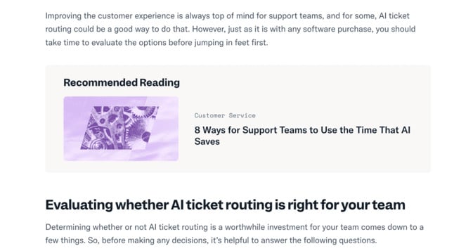
Category: SaaS Company
Steal This Idea: Sharply-designed “Recommended Reading” sections throughout posts.
Help Scout uses their blog to educate about customer service and issues around growth and culture, as well as to give inside peeks at the company and its software.
Another company where minimal design and a simple color palette help their customer-focused content stand out, Help Scout keeps the reader experience front and center.
11. InVision
Category: Design Software Company
Steal This Idea: The InVision blog displays a “see the latest insights” at the bottom of each blog post.
InVision offers a digital product design platform that provides collaboration tools and prototyping software.
Their blog, Inside Design, has a simple and clean design with brightly colored images that capture attention. They include these CTAs alongside more traditional inline content boxes.
12. Julian Shapiro
Category: Writer’s Blog
Steal This Idea: Uses minimal design with consistent branding, letting the blog content take center stage.
Julian Shapiro has a writer’s platform that falls into the less-is-more category. He uses his blog to “deconstruct how things work” and writes in-depth handbooks about topics ranging from growth marketing to writing to building muscle.
Julian’s minimalist design aesthetic allows for his brilliantly written content to shine. If you want your content to be the star, consider borrowing from Julian’s blog design inspiration.
13. Maria Killam: Colour Me Happy
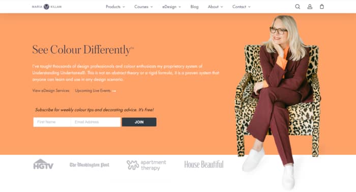
Category: Interior Design
Steal This Idea: Makes excellent use of “before” and “after” project example images.
Interior design blogs often make the list of blog design inspiration, along with graphic design and web design blogs. And with their focus on beautiful imagery and blog layout, it’s no wonder.
Maria Killam’s blog is an example of how you can use photographs and images to support and explain blog content.
There’s nothing like using before and after images to tell a story, and Maria uses plenty of photographs to document dramatic transformations.
14. Math3ma
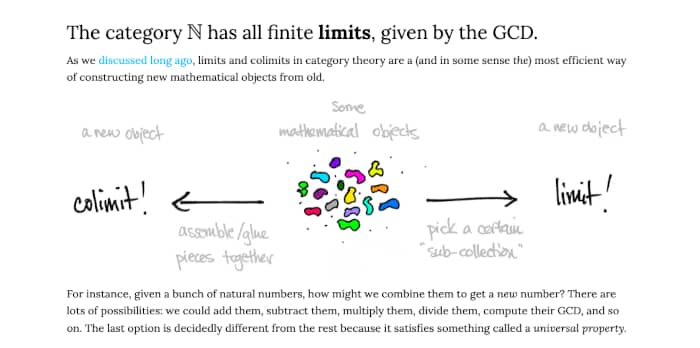
Category: Education
Steal This Idea: Uses colorful illustrations within blog articles to help explain complex mathematical concepts.
You’ve probably heard the adage “a picture is worth a thousand words,” and Math3ma’s Tai-Danae Bradley uses both writing and drawing to help readers understand the technical jargon behind mathematical ideas.
Math3ma reminds us that even the most complex subjects can be broken down and explained. Even those who struggle with math might find the articles on math “fun facts” entertaining!
15. Mr. Money Mustache
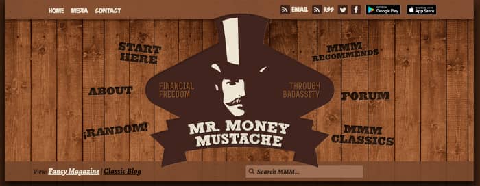
Category: Personal Finance & Lifestyle
Steal This Idea: This WordPress blog gives users the option to switch between the “Classic Blog” and “Fancy Magazine” layouts.
Mr. Money Mustache retired in his thirties and now writes about how to live a frugal yet “badass life of leisure.”
When you first visit the site, the default view is a traditional blog layout. But with the click of a link, readers can choose a fancier layout with featured articles, classic posts, current reads, recommendations, and more.
If you’re just starting as a blogger, this design idea won’t be the best use of your time. But for anyone with an established blog looking for something new to create that “wow” factor, a blog layout change could be just the thing.
16. Nerd Fitness
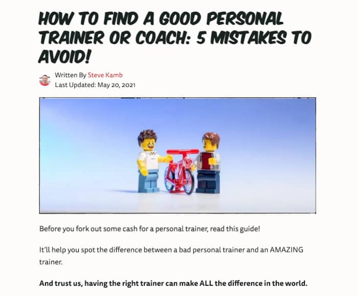
Category: Fitness Blog
Steal This Idea: Good use of overall branding, design, and site consistency.
Steve Kamb, the founder of Nerd Fitness, created a unique and compelling brand identity. With a worldwide audience of “people with desk jobs that love nerd culture, games, books, and movies” standing beside him, it’s evident that his branding speaks to them.
The entire site is full of nerd culture references, from Morpheus to Optimus Prime, and the resounding call to action is to “join the Rebellion.”
Their training philosophy is rooted in behavioral psychology, but the overall vibe is that getting healthy and leveling up can actually be fun.
17. Noah Kagan
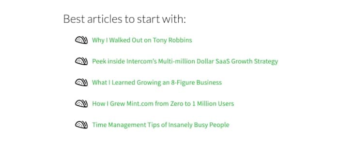
Category: Business Education
Steal This Idea: Includes a “Best Articles to Start With” section on the homepage, giving new readers guidance about what to read first.
Noah Kagan uses the blog at OkDork to share his stories on “marketing, starting a business, personal improvement, and productivity tips.”
When you scroll down past the sections with his latest posts, a plug for his podcast, and a newsletter CTA, you get to a hand-curated selection of popular posts with highly compelling titles.
Right from the start, Noah positions himself as a business and marketing expert. What topics can you write about that demonstrate your expertise?
And how can you write headlines so compelling your readers can’t help but click?
18. Pixelgrade
Category: WordPress Theme Designer & Blog Design Company
Steal This Idea: Post sections use different but complementary colors.
Upstairs is the Pixelgrade blog, a “place of discovery, learning, and meaningful connections built around creating beautiful and successful websites.”
As well as offering blog design templates and themes, the team uses their blog to showcase their products and teach their customers how to craft great websites.
The visuals on Upstairs blog posts remind me a bit of a landing page, with each new section using a different set of colors. The switch keeps visual interest, and the consistent color palette ties it all together.
19. Sumo (Now BDow!)
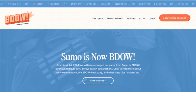
Category: Software Company
Steal This Idea: Quirky design elements and a bright, energetic color palette
The fact that Bdow! (formerly Sumo) uses “stories” for their blog URL should tell you something. The blog is full of case studies as well as more traditional blog posts. They take the success of their customers seriously and have the data and stories to back it up.
But that doesn’t mean they don’t enjoy creative blog design as much as the next company. Their use of quirky but consistent design elements makes their content stand out no matter where you’re reading it.
20. The Londoner
Category: Lifestyle & Travel Blog
Steal This Idea: Uses photos with mouse-over links to blog articles instead of more standard navigation links.
The Londoner includes posts about life, travel, style, and recipes. Their homepage dazzles with images of the travel lifestyle the author leads. But these images pull double duty, also serving as blog post links.
The posts are full of written stories, but it’s the images that draw the reader more deeply into the lived experience.
21. Urban Influence
Category: Design & Branding Company
Steal This Idea: Makes creative use of visual headings and subheads.
The headline at the top of the Urban Influence blog leads to posts about work, learning, life, and inspiration. As a company that helps other businesses to craft their online presence, it’s not surprising the Urban Influence blog has a stunning blog design.
One of my favorite ideas from a recent post of theirs is the visual subhead pictured above. Rather than stick to a standard typography-based subhead, they used a striking visual image to make the subhead stand out.
Now you’ve seen the examples, let’s dig into the design practices that make them work.
5 Blog Design Tips for Maximum Impact
While opinions may change about what makes a good blog design, a few key elements will stand the test of time.
Let’s look at five areas where your personal blog design can stand out from the crowd.
1. Keep Your Brand Consistent
While flashy design elements may be fun right now, blogging success depends on maintaining a consistent brand.
- Consider Color: choose a consistent and complementary color scheme, with two or three colors max. All links should be the same color.
- Think About Typography: like your color palette, choose two or three fonts to use throughout your design. Use serif fonts for body copy.
- Make Use of Multimedia: think ahead to the types of photography, illustrations, videos, and blog graphics you will need. Use high-quality images (properly sized) and choose consistent image dimensions (your blog page template might tell you what sizes are ideal).
2. Make Your Reader Top of Mind
What are the goals of your overall website, individual pages, and blog posts? Keep these goals in mind as you design your blog.
- User Interface (UI) Design: how easy is it for your reader to use your website? Aim for clear, simple, and intuitive navigation using menus and internal links. Keep your section headings and subheads (H2, H3, H4) organized and consistent.
- User Experience (UX) Design: this is where great content comes in. Keep your blog audience-focused (empathy is essential) and highlight your best content. It’s also helpful to have both evergreen content as well as more timely articles.
- Social Media Integration: make it easy for your readers to share content they love. Keep your social icon design consistent.
3. Consider Page Performance
How fast your website loads has a lot to do with your SEO results. There are some easy things you can do to speed up your site.
- Apply Responsive Design Recommendations: make sure any blog design templates or themes you consider are mobile-friendly.
- Design for Accessibility: some of your readers may have visual, physical, or other disabilities. You can make quick changes to make your site more accessible, including providing visual contrast, clearly labeling all forms, and using alt text for all images.
- Pay Attention to Page Load Times: use these simple fixes for slow site speed, so your readers don’t get frustrated and leave.
4. Follow the Crowd
There will be times where you want to stand out from the crowd, but some aspects of your blog design are better when you follow convention.
- Embrace Whitespace: help your readers stay engaged by using short paragraphs and leaving space between your text.
- Keep Readers Engaged: decide whether to use a single sidebar or no sidebar at all, and use the space to highlight other posts or resources that might be helpful. An easily accessible search bar will help your readers find what they’re looking for.
- Call Readers to Action: keep your primary CTA (call to action) above the fold, build trust through consistency, and get readers ready to take action.
5. Keep It Simple
Most importantly, don’t make it complicated. Yes, there are a million rules you “should” follow when it comes to your blog design. But what counts is that your readers find what they’re looking for and come away happy.
Now you’ve learned more about what goes into great blog designs and picked up some new ideas, what’s next in your blogging journey?
Next Stop: Creative Blog Design
With the best design practices under your belt and these examples fueling your inspiration, now it’s time to choose the design elements you want to use in your blog.
Remember, your blog design should be all about you and your readers. Who are you as a blogger and a brand? And what do you think will resonate with your ideal readers?
Take a minute and write down your ideas. Think about how you can incorporate any of the design elements from this post that will make for a great blog.
And then get out there and wow your readers with your first-rate blog design.


Note: Comments are closed on this article, but the earlier discussion is still here if you’d like to read through it.