These fonts have been handpicked for their accessibility and reader-friendliness. They’re not just a treat for your eyes — they’re also perfect for making your written content more approachable for a wider audience.
As a sight-challenged reader and writer, I appreciate these simple, easy-to-read fonts, and I know you will too.
Ready to ditch that squint and give your eyes a break?
Let’s dive right in.
1. Break the Mold with Bookerly

Also known as Kindle’s secret powerhouse, Bookerly is Amazon Kindle’s default font, but it doesn’t have to stay confined to your e-reader.
This font was developed with readability at the forefront, ensuring maximum comfort for your eyes during those long reading sessions.
But guess what?
It’s equally suited for word-processing tasks and website design.
Its unique design and balanced letter spacing make it a perfect candidate for a variety of text-heavy tasks.
Imagine drafting your next proposal or designing your website with Bookerly.
Not only would it look fresh and distinctive, but it would also be a delight for people to navigate.
The ease of reading Bookerly allows for quicker comprehension and reduced eye strain — a win-win for both you and your reader.
Your choice of font can subconsciously influence a reader’s perception of your content.
So why not make a great impression with Bookerly?
2. Make an Impact with Montserrat

Bold and modern, Montserrat is a font that creates an impact while ensuring easy readability.
Inspired by the old posters and signs of Buenos Aires, this font brings a certain charm without sacrificing the audience’s comfort.
Consider using Montserrat in your marketing collateral or digital designs.
Its striking design allows for memorable headers, while its clarity ensures your message isn’t lost in aesthetics.
Even when you’re designing a PowerPoint presentation, Montserrat’s clarity and boldness help ensure your points stand out clearly.
As a bonus, Montserrat isn’t limited to titles or headers; it’s equally effective for body text.
So, when it comes to delivering a strong impression without compromising on readability, Montserrat is the font for the job.
3. Try The Timeless Classic: Helvetica
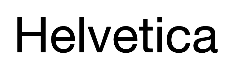
Helvetica has stood the test of time as a universally beloved font, and is largely considered one of the most popular in the realm of graphic design.
It’s the epitome of clean design and readability, making it arguably the easiest font to read and work with.
Its perfect blend of aesthetics and clarity also makes it a great choice for a wide range of applications.
Think of creating corporate brochures, marketing materials, and other enticing documents with this font to leverage a sense of directness and confidence.
Using Helvetica ensures your message is conveyed clearly and professionally, leaving a lasting impression on the reader. On digital platforms, its simplicity shines, making website text or email content engaging and easy to digest.
4. Create Quality Content With Quicksand

Don’t let the name fool you, Quicksand won’t bog you down.
This sleek, modern font is clean, with rounded edges that make for comfortable reading.
It’s a versatile option that suits a myriad of applications — including presentations, digital marketing content, or print materials.
Quicksand is also particularly good for headers, with its round, open design offering a friendly yet stylish welcome to your target audience.
It’s appealing to the eye, easy to read, and pulls people in, setting the stage for the content that follows.
Additionally, Quicksand is just as effective for body text. Even in smaller sizes, it maintains clarity and readability.
Offering a blend of style and user-friendly design, Quicksand might just be your next go-to font.
5. Ditch the Cliché with Lato

Looking for a fresh take on sans serif fonts?
Enter Lato.
Arial had its time in the sun, but Lato brings something new to the table.
This semi-rounded font boasts a sleek, modern feel, with its balanced letter spacing and high legibility making it one of the easiest fonts to read.
Let’s say you’re designing a new business card.
Using Lato would not only set you apart but also ensure the text remains clear, even in small print.
Or perhaps you’re revamping your website.
Replacing the overused Arial with Lato can give your site a fresh feel without compromising readability.
Lato is a font that can adapt to your needs while prioritizing the ease of reading for your audience.
It’s an underappreciated gem able to make your content shine.
6. Don’t Neglect The Unsung Hero: Verdana
Often overlooked, Verdana is a trusty standby in the world of fonts, and for a good reason.
This clear and spacious font stands as one of the easiest to read, particularly on screens.
Its wide letter spacing and tall height make it ideal for reading on small devices, like phones or tablets.
Imagine browsing a web page with tiny, crammed text on a smartphone — doesn’t sound appealing, does it?
Now replace that mental image with a clean Verdana-styled page.
Suddenly, the content becomes friendlier, more inviting, and significantly less intimidating.
Using Verdana for your website or digital content can make a world of difference to your readers’ experience. And the best part?
It’s pre-installed on most computers, so it’s ready to be your unsung hero.
7. Combine Elegance and Accessibility With Georgia
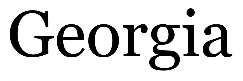
A font known for its elegance and clarity, Georgia strikes a perfect balance between style and readability.
Its well-proportioned letterforms and generous spacing make it an easy font to read, ideal for both digital and print media.
Imagine drafting a digital newsletter or creating a website for a luxury brand.
With Georgia, you add a touch of class to your text while ensuring that your message remains clear and easily digestible.
Its unique design allows it to retain its clarity even at smaller sizes, ensuring accessibility across all platforms.
8. Get Stylish with Roboto

Roboto and its many variants is the Google font, designed with an eye for both style and functionality.
It’s no surprise that this font, with its straight lines and friendly curves, ranks among the best fonts to work with.
Its design adapts seamlessly to a wide range of uses — think mobile apps, blogs, or even e-books.
Say you’re developing a mobile app, and you want to ensure a smooth user experience.
Using Roboto for your app’s text guarantees a clean, easy-to-read interface that users will appreciate.
Similarly, if you’re drafting a blog post, Roboto’s optimal readability can hold your audience’s attention, encouraging them to explore your content in depth.
It’s a font that’s friendly, legible, and stylish all in one, ready to enhance your readers’ experience.
9. Step Up with Merriweather
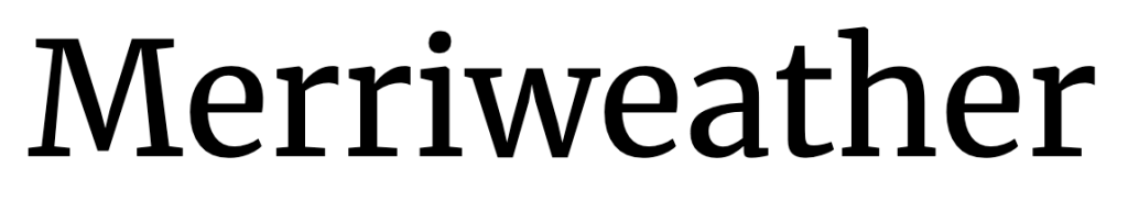
Merriweather was designed for screens — and it shows.
Its unique design, featuring a large height and slightly condensed letters, offers excellent readability, even on high-density displays or small screens.
This makes it one of the easiest to read, no matter the font size.
Imagine you’re designing a website meant to be accessed primarily on smartphones.
By choosing Merriweather, you ensure that your text content remains crystal clear, even on the smallest of screens. Similarly, for an e-book meant to be read on a variety of devices,
Merriweather’s adaptability and clarity ensure a comfortable reading experience. So why not step up your screen-friendly design with Merriweather?
10. Prioritize Painless Reading with PT Sans

PT Sans is the font that’s here to make screen reading painless.
Specifically designed for clarity and ease, PT Sans is a solid choice whether you’re creating web content or drafting a report.
Envision an educational website with complex information.
Using PT Sans can help present the material in a clean, easy-to-read format, ensuring that learning remains the focus, not struggling with the text.
Similarly, for a report meant to be read on-screen, PT Sans’ readability can keep people engaged and focused on your work.
It’s a font that simplifies screen reading, making it a breeze instead of a chore.
Give PT Sans a shot and see the difference it can make.
11. Please Your Audience With Open Sans

Open Sans, as the name implies, is welcoming and very readable.
It’s versatile, clean, and incredibly easy on the eyes, making it a top choice among the easiest fonts to read.
From website design to printed materials, Open Sans is a crowd-pleaser!
Imagine designing a user-friendly website.
Open Sans offers a clean look that is pleasing to the eye, ensuring that visitors can easily navigate your site.
For printed materials like brochures or reports, Open Sans maintains its clarity, making your text content accessible and engaging.
It’s a font that keeps giving, improving the user experience no matter where it’s used.
12. Discover the Joy of Reading with Fira Sans
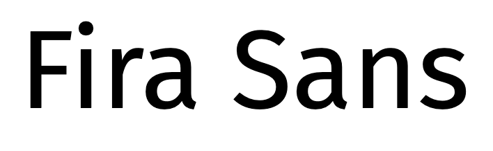
Fira Sans is a wonderful, adaptive font that offers several weights and styles.
It’s designed to be recognizable even at a smaller font size and on smaller device screens. So, if you want to discover the joy of easy reading, Fira Sans is a solid choice.
Consider using it in your blog or your optimized social media posts.
Its readability ensures that your audience can enjoy your content without straining their eyes.
For a newsletter or email campaign, Fira Sans’ adaptability lets you play with styles while maintaining excellent clarity.
It’s a font that adapts to you, not the other way around.
13. Give Life to Your Content with Lora
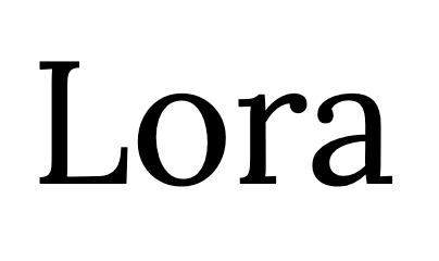
Lora is a serif font that combines a classic touch with modern readability.
Its balanced brush strokes and clear letterforms make it one of the easiest fonts to read, especially for longer texts.
Let’s say you’re writing a novel or a self-publishing a book.
By choosing Lora as your font, you provide a comfortable reading experience, encouraging audiences to engage with your text in-depth.
Its classic feel adds a level of sophistication, transforming your content into a beautiful piece of work.
Lora isn’t just a font — it’s a tool to breathe life into your writing.
14. Refurbish Your Work With Raleway
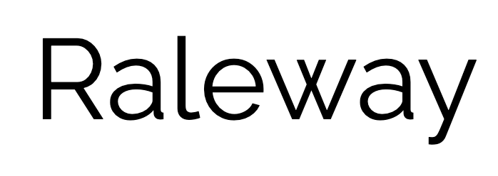
Raleway is a sans serif font that carries a powerful yet elegant presence.
With its strong lines and wide spacing, Raleway is not only easy on the eyes but also infuses style into your text.
Consider Raleway when you’re looking to create an impact with your presentation.
This bold font will ensure your headings stand out while maintaining readability.
Or perhaps you’re designing a stylish portfolio or resume.
With Raleway, you ensure that the audience can easily navigate your accomplishments while adding a touch of sophistication.
Its design combines a stylish presentation with easy readability, making it a powerhouse of a font.
Wrapping Up: Revolutionize Your Reading with the Easiest Fonts

And there you have it, folks!
A roundup of the easiest fonts to read for accessibility and speed.
The right font can make all the difference, whether you’re reading for pleasure, work, or making your content more accessible for others.
So why not give these fonts a try and see the difference for yourself? After all, who wouldn’t want a more relaxed, easy, and speedy reading experience?
Go ahead, make the change today!
You’ll be surprised by just how much your audience (and eyes) will thank you for it.


Helvetica all the way for me as a reader. Seems to be a classic font for a reason. As for my blog, my readers never offered feedback on font flaws so I use what seems to be working. If that changes though I have a list of rich resources here Liliana.
Ryan